The iPod’s Dark UI Pattern
Normally when you think of “bad design”, you think of laziness or mistakes. […] Dark Patterns are different – they are not mistakes, they are carefully crafted with a solid understanding of human psychology, and they do not have the user’s interests in mind.
Let me draw your attention to a UI element within the iPod app that certainly doesn’t have the user’s interests in mind.
As the user navigates back through the hierarchy of songs, albums and artists, they are met with a ‘Store’ button. At first, this seems quite innocent. However, when you study it a little further you get the feeling there’s something else at work. The ‘Store’ button was not always here, this used to be a blank area; this signals something. It tells us that Apple want to increase iTunes activity at the point of music consumption. That’s still pretty reasonable; let me explain what’s really going on.

While it doesn’t conflict with any of Apple’s iOS Human Interaction Guidelines, it does however violate user intent and habit; and there are many strong points to support this claim:
In the mind of the user, the ‘Store’ button does not follow logically from the series of events that lead up to it. The users intent was to navigate back to the Artists list, not to launch iTunes. Note: As the user is in the process of making a drastic change to what they’re listening to rather than an incremental change like switching tracks on an album, the user is even more vulnerable to whatever they might see in iTunes.
Apple are aware of this intent and they’re exploiting the user’s desire to change songs.
The number of backward steps in the iPod hierarchy is not always consistent. Sometimes it takes two taps to return to the Artist list, other times it requires three, perhaps even four taps. In response to this, it’s a common habit for users to over-tap in an effort to get back to the artists page as quick as possible. We all do this, especially as we wait for the side scrolling animations to pass.
Finally, Apple are threatened by Spotify et al. Much like the original iTunes experience, Spotify are changing the rules of music consumption. When an idea held dear is under attack, one must expect reactions such as this.
To summarize. The user wants to listen to different music and they want it now, the user taps back until they think they can’t go back any further, but suddenly the ‘Store’ button appears from beneath their finger and boom the user is now in the iTunes store. (Note: The ‘Store’ button doesn’t fade in from the left. No. It appears from beneath the users finger.)
When I first noticed this, I thought I was doing something wrong, but it soon dawned on me that it wasn’t my fault at all. It was carefully designed to do this, and it’s doing it. Apple monitor referral traffic from apps, so I’d love to see how much traffic is coming from that store button, and even more revealing, how much traffic leaves within seconds of arriving.
I’m sure many of you will disagree. You’ll argue that I’m speculating too much, or that it’s all too vague, or that Apple would never do something like that. Well, I’d argue, that if anyone was to design something so brilliantly
malevolent, it would be Apple. They are human too.
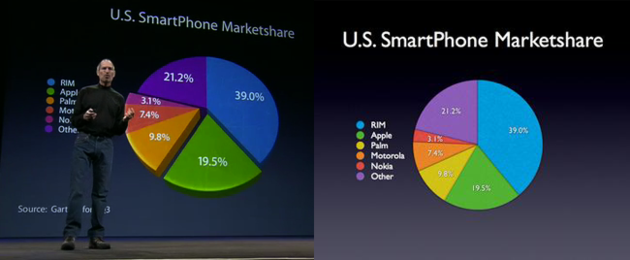
Just check out this slide from a 2008 keynote. Notice how Apple’s segment is angled towards you giving it the appearance of being the largest segment, but statistically, they’re almost 50% that of the genuine largest segment, RIM. That’s dark design.
I have a feeling, this is just the tip of the ice-berg.
I am the co-founder of Hypercube. We working on some very exciting ideas that will transform the way we build and use mobile apps.
Sign up today, we’ll be making a big announcement soon.
