I find myself squinting
The primary purpose of a map is to orientate the user so they can better decide where they need to be next. Similar to the wheels on a bike, maps are a utility to get one from a–to–b. I believe Apple may have underestimated this when creating their latest iOS 6 Maps.
There’s no denying Apple have done a great job with hardware; yet, when they start designing user interfaces they seem so enveloped by the interface that they forget the user. Maps are all about data and function, so it’s no surprise google have done such a good job. Apples maps are awkward to read. I find myself squinting, but of course that does nothing to help.
In addition to that, Apple seem to have issues plotting their data correctly. There’s no Airport in Dundrum (a suburb of Dublin), and there’s certainly no Zoo in the heart of Dublin City center. I live here.
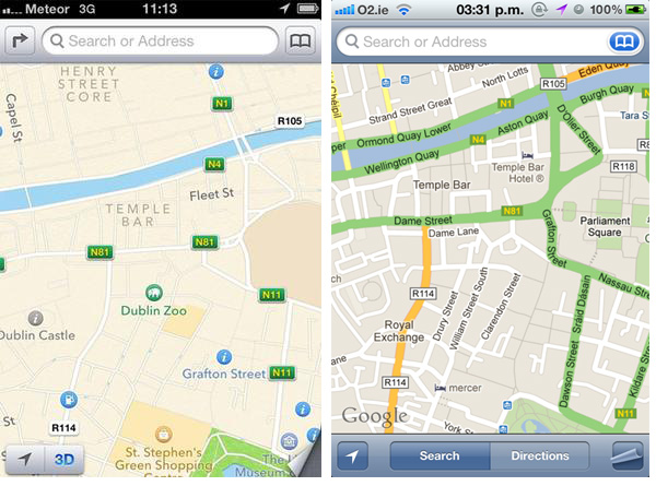

This is particularly interesting to me as I’ve previously designed a printed map for the same area of Dublin City shown in the first image above.
