Terrible copywriting on Apple.com

Apple just updated their iPhone page with a “Why iPhone” tab. Undoubtedly created to swoon any potential customers that may be debating between the recently announced Samsung Galaxy S4 and not-so-new iPhone 5. With examples, I plan to demonstrate where Apple could have improved their copywriting. Copywriting is an important but often neglected discipline.

Traditionally, beginning a sentence with “and” (a conjunction) is not recommended. This is because “and” is used to link or compare two points. Separating them with a period can create an awkward cadence. However, perhaps in this case the line-break forgives.
The issue here is about sentiment, “and” coming after “There’s iPhone” is like some sort of vague comparison with their competitors. The next five sentences confirm this, first by opening with a question, then an uncertain answer, then another sentence beginning with a conjunction, then two more awkward redundant sentences.
Apple should have stopped at the headline, because the rest is junk. There is no need for the extra sentences. The phones and apps are enough at this point. In fact, had they left out the extra sentences it would have taken on an entirely new and better meaning.
I would have run with:
There’s iPhone.
Then there’s everything you can do with it.
As if to suggest that just owning an iPhone is something special, this would have appropriately set the tone, and nicely segued the reader into more detailed information.

Next up is some award that looks like a Jukebox that no one outside of the U.S. has ever heard of before. It’s great that people think Apple has a nice product, but I really don’t care what these guys think of it. J.D. Power and Associates means nothing to me. It occupies no point of reference in my mind, and thus means nothing to me. Apple should know their audience. If anything, this brings in to question what Apple values, or more importantly, what Apple thinks I value. So far, I’ve no inclination to buy an iPhone.

This one is simple. Apple use the same word –Great– to describe a good thing and a bad thing. Great. It’s not smart, it’s not witty, it’s bad, it’s muddled. It doesn’t leave the right impression. Be clear. That’s all you have to do, ever.
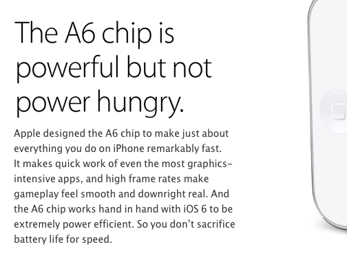
Again, using the same word to describe a good thing and a bad thing. There’s no need for it. Just be clear.
There are a bunch of other things, but it’s late and I’m tired. Whoever wrote this copy probably shouldn’t write copy for Apple anymore. Finally, notice how there are no black iPhones featured on the entire page, they are all White. I wonder if there’s a strategic reason for that, probably not.